
Overview
The Two Column Content module places two pieces of content side by side and stacks them cleanly on mobile.
- Flexible columns: Each side can be Image, Text, Video, Form, or None.
- Full-width image layout: Let an image reach the edge of the screen while the text stays aligned with your page container.
- Smart buttons: Add standard links, HubSpot CTAs, or popup buttons that open a HubSpot form.
- Backgrounds: Use Color, Gradient, Image, or Video, with an optional overlay.
- Responsive control: Set column widths, gaps, spacing, and column order for desktop, tablet, and mobile.
- Performance-friendly: Scripts load after the page is ready, and popup forms load only when a visitor clicks.
Installation
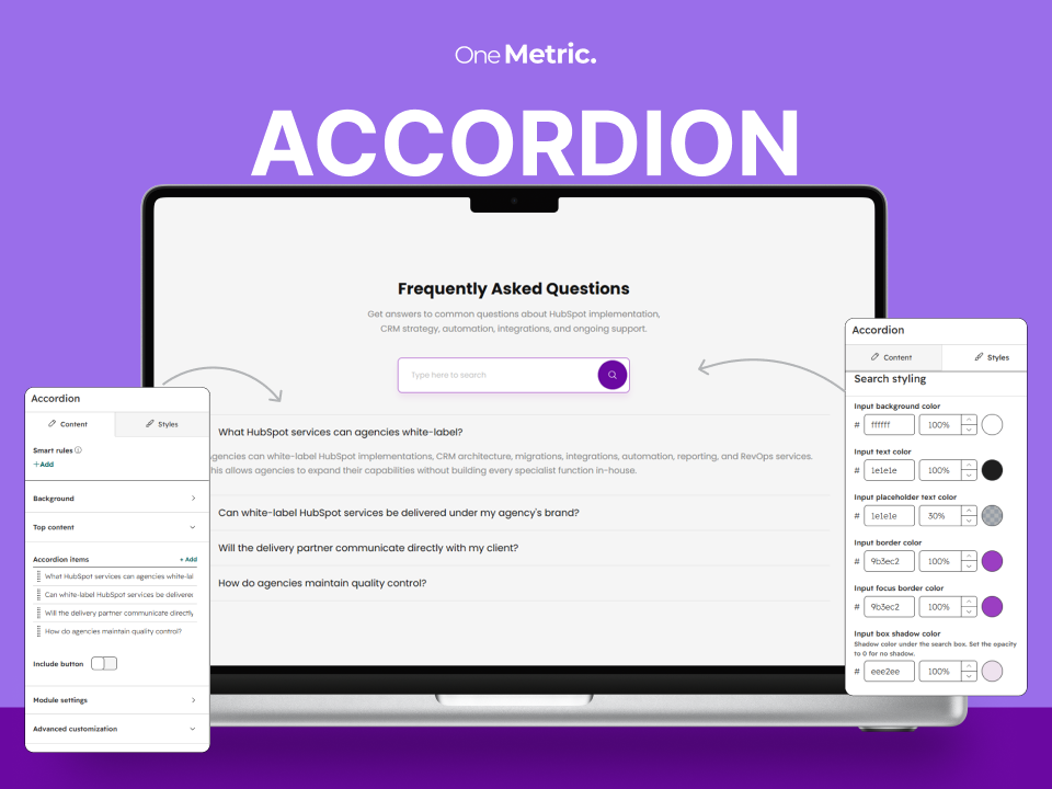
Background
Choose None, Color, Gradient, Image, or Video for the section background.
- Color: Pick any solid color.
- Gradient: Add multiple colors and set the gradient direction.
- Image: Choose an image, size, position, and whether it stays fixed on scroll (parallax effect).
- Video: Add a looping, muted background video.
- Overlay: For Image and Video backgrounds, add a color or gradient overlay so text stays easy to read.
Top Content
Add an optional title and rich-text description above the two columns.
- Choose the heading tag (H1–H6) for the title.
- Set alignment, bottom spacing, and optional maximum width.
- Choose title and description colors.
- Set separate alignment and spacing for mobile.
Left and Right Sections
Each column works the same way. Choose one of five content types.
Image
- Upload an image with alt text, size options, and lazy loading.
- Set the corner radius for each corner.
- Choose Standard or Full Image layout. Full Image lets the image reach the screen edge, while the text column lines up with your page container, even when the screen is resized.
Text
- Add a heading with your choice of heading tag, and a rich-text description.
- Turn on Event Details to show Location, Date, and Time. This suits webinars, events, and workshops.
- Add one or more buttons (see Buttons below).
- Set heading, description, and event text colors, plus text alignment (separately for mobile).
Form
- Select any HubSpot form.
- Choose what happens after submit: show a thank-you message or redirect to a page.
- Style the form: background color, top border color, label color, input text color, input background color, and inner spacing.
- Set the form's corner radius.
Video
- HubSpot video: Upload a video with autoplay (muted, looping) or standard controls.
- Embed: Use a YouTube or Vimeo link, or paste embed code.
- Preview image: Add a cover image, set its position, and show a play button over it.
- Play icon: Choose the play icon color and its background color.
- The cover and play icon hide automatically once the video starts.
- Set the video's corner radius.
None
Leave one column empty when you only need one side.
Buttons
Add one or more buttons to any text column. Each button can be one of three types.
- Standard Button: Add text and a link. It supports page links, email links, and phone links. You can also open in a new tab and set the link rel attribute.
- CTA Button: Use a HubSpot CTA.
- Popup Button: Open a popup with a top content area, an optional HubSpot form, and a bottom content area.
Button style options: Primary or Custom.
Custom buttons let you set text style, background color, border width, border style, border color, and corner radius, for both the default and the hover state.
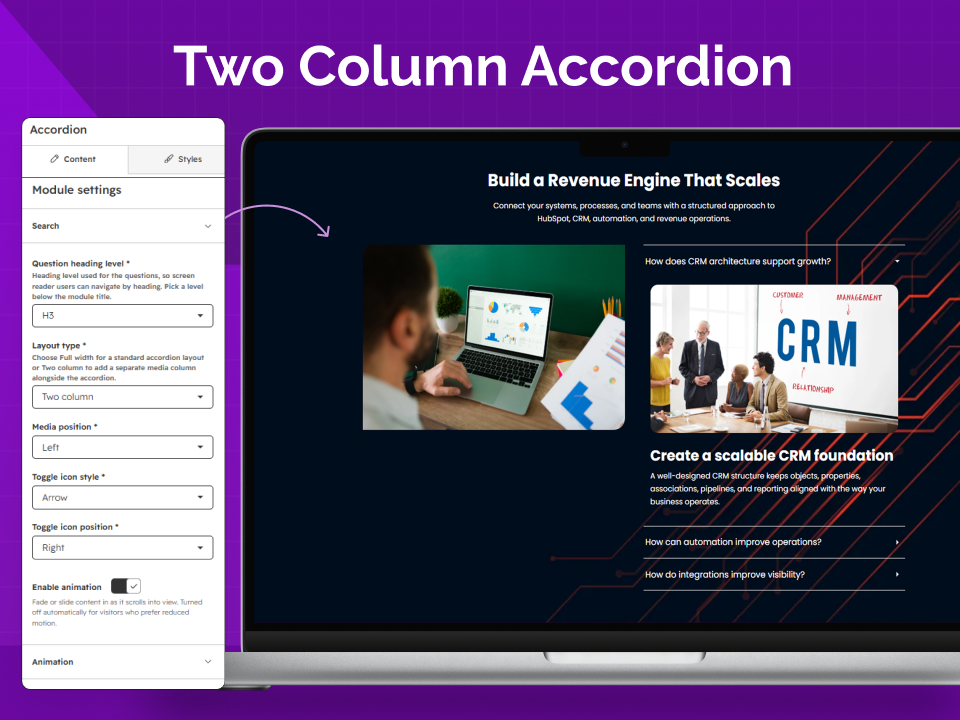
Popup Button
The popup is built for lead capture and is accessible.
- Add top and bottom rich-text content around the form.
- Choose the HubSpot form and the post-submit action (message or redirect).
- Style the popup: width, background color, corner radius, overlay color, inner spacing, and close button colors.
- It closes with the close button, a click outside the popup, or the Esc key.
- Keyboard users stay inside the popup while it is open, and the page behind it does not scroll.
- A loading spinner shows until the form is ready.
- Motion is reduced for visitors who prefer less animation.
- The form is loaded only when a visitor clicks the button, so it does not slow down the page.
Module Settings
- Vertical alignment: Align the two columns to top, center, or bottom.
- Right column width: Set the width as a percentage. The left column adjusts automatically.
- Column gap: Set the space between the two columns.
- Mobile row gap: Set the space between the stacked columns on mobile.
- Mobile column order: Choose whether the left column shows first or last on mobile.
- Animation: Turn on fade-up animation for the top content, both columns, and buttons.
Style Settings
Use the Styles tab to adjust the module without editing code.
- Container: Choose a standard container, a custom width, or full width.
- Section spacing: Set separate spacing for desktop, tablet, and mobile.
- Top content: Alignment, width, spacing, and colors.
- Text columns: Heading, description, and event detail colors, plus alignment.
- Form columns: Form background, border, label, and input colors.
- Video columns: Play icon and background colors.
- Image and video columns: Corner radius.
- Popup: Width, colors, overlay, radius, and spacing.
- Buttons: Custom default and hover styles.
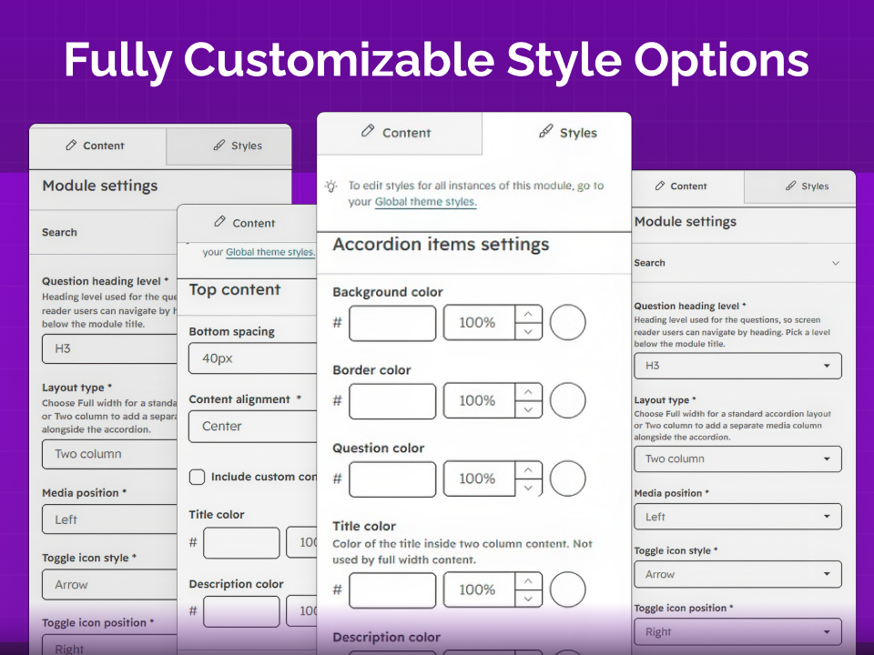
Advanced Customization
Use CSS class selector or CSS id selector for targeted custom styling or a page anchor link.
How to Use
Tip: Use only one H1 per page, and keep heading levels in order. Use clear button text such as "Book a demo" rather than "Click here."
Conclusion
The Two Column Content module works for hero sections, feature highlights, video sections, event pages, and lead-capture blocks. Choose the content for each column, then adjust the layout and style to fit your page.