
Overview
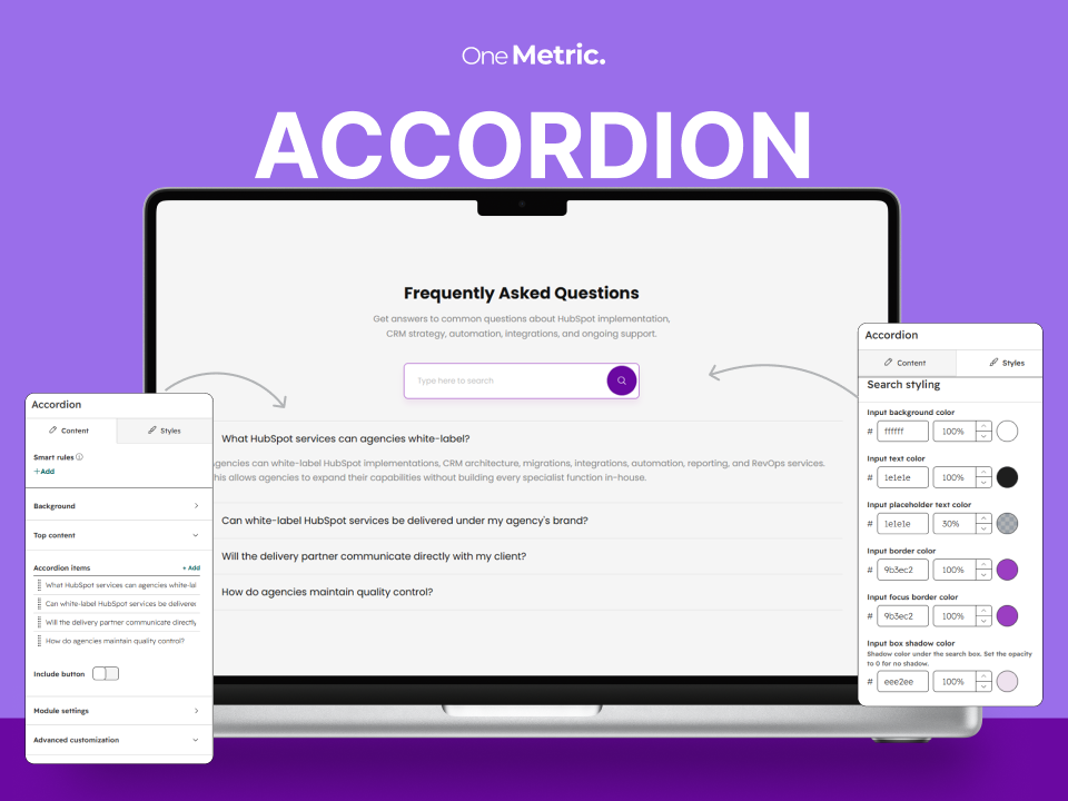
The Accordion module organizes FAQs and expandable content in a responsive layout.
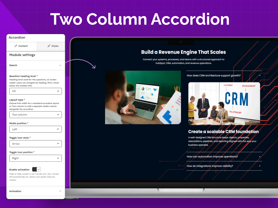
- Content layouts: Full-width answers or two-column answers with an image.
- Search: Let visitors find questions quickly.
- Customization: Choose backgrounds, toggle icons, buttons, animations, and styling.
- Responsive: Adjust spacing and layout for desktop, tablet, and mobile.
Installation
Background
Choose Color, Image, Video, Gradient, or None for the section background. Depending on the selected type, configure the matching background fields and optional overlay.
Top Content
Add an optional title and rich-text description above the accordion. Select the appropriate heading tag when a title is provided.
Media Column
For the Two Column layout, add a supporting image beside the accordion and adjust its corner radius if needed.
Accordion Items
Add and reorder repeatable question-and-answer items. Each item can use one of these layouts:
- Full Width Content: A rich-text answer.
- Two Column Content: An image beside a title and rich-text description. Set image width, position, corner radius, and vertical alignment.
Optionally add a button to an individual item using a standard link or HubSpot CTA. Custom button styling includes default and hover states.
Buttons
Use an optional section-level button below the accordion. Choose a standard HubSpot link or CTA, then use the primary style or customize its default and hover appearance. Individual accordion items can also have their own buttons.
Module Settings
- Search: Enable search and set the placeholder, accessible label, and no-results message.
- Question heading level: Choose the heading tag for accordion questions.
- Layout: Select Full Width or Two Column and set the media position.
- Toggle icons: Choose Arrow or Plus/Minus and position it left or right.
- Animation: Optionally configure animations for top content, accordion items, and buttons.
Style Settings
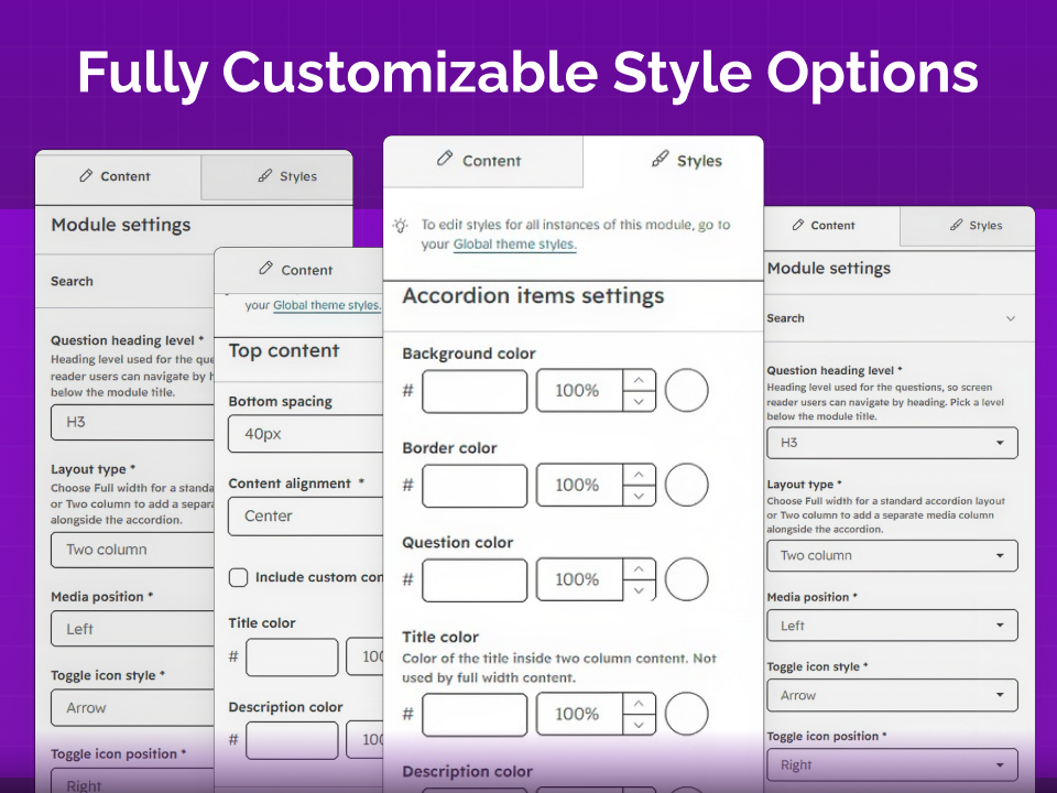
Use the Styles tab to adjust the module without editing code.
- Typography: Set the font family used across the module.
- Spacing and container: Configure responsive section spacing and content width.
- Top content: Adjust alignment, spacing, width, and title/description colors.
- Accordion items: Style item backgrounds, borders, question text, content colors, and expanded states.
- Search and buttons: Customize search field colors and button alignment.
Advanced Customization
Use CSS class selector or CSS id selector when you need targeted custom styling or a page anchor.
How to Use
Tip: Keep question heading levels consistent with the page structure and use descriptive button text.
Conclusion
The Accordion module is suitable for FAQs and other expandable content. Configure the content, layout, search, and styling to fit your page.